Top 10 Tips for Choosing the Right Paint Colors for Your Home (That Other Blogs Miss)
Choosing the right paint color for your home can feel surprisingly overwhelming. What looks perfect in a catalog or showroom often feels completely wrong once it’s on your wall. Lighting, furniture, flooring, and even your home’s location can all affect how a color appears and feels. That’s why many homeowners end up repainting a space within the first year—an expensive and frustrating fix.
This guide offers ten advanced, lesser-known tips to help you confidently choose paint colors. You won’t find fluffy, recycled advice here—just solid insights from a trusted Boynton painting contractor on how color truly performs in real-world environments.
1.Understand How Natural Light Alters Color
One of the biggest mistakes people make is forgetting how much natural light affects color appearance. A north-facing room receives cooler, bluish light throughout the day. This can make cool colors look colder and warm colors appear more muted.
On the other hand, south-facing rooms get warm, golden light that can make some paint colors feel brighter or more yellow than expected.
Rooms that face east or west shift dramatically in tone throughout the day. Always consider how much daylight the room gets and from which direction. What looks calm and soft in the morning could feel harsh or gloomy by nightfall.
2.Use Objects Before Paint Swatches
Instead of starting with paint swatches or paint chips, begin by placing colorful items—like pillows, fabrics, or art—around the room. Watch how these different hues look in your space across the day. This helps you understand what tones naturally work with your existing decor, flooring, and lighting.
Once you notice a pattern—maybe you’re always drawn to softer hues or bold colors—it becomes easier to find a jumping off point for your search. Use these observations to guide you toward the right color palette before testing paint color samples from your local paint store.
3.Match Paint to Your Micro-Climate
Most blogs don’t discuss how paint reacts to your local environment, but it matters. For example, exterior paint on homes in coastal areas can fade quickly due to salt air and UV rays. Specific finishes may encourage mold or mildew in high-humidity areas unless you use moisture-resistant interior paint colors.
Even indoor wall colors can behave differently based on humidity and temperature. If you live in a very dry or very wet region, consult a paint store or color consultant about formulas and shades. Find out whether a lighter shade that reflects more light or darker shades for warmth perform best in your area.
Sometimes, the solution isn’t to repaint everything but to adjust strategically instead of just applying paint without a deeper understanding of how the climate affects longevity and appearance.
4.Paint for Emotion and Flow, Not Just Aesthetics
Color psychology isn’t just about choosing calming blues for a bedroom or bathroom. It’s also about how you feel moving from one single room to another. Paint color inspiration can come from emotions as much as style.
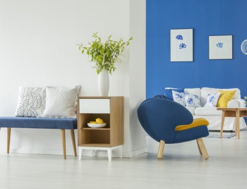
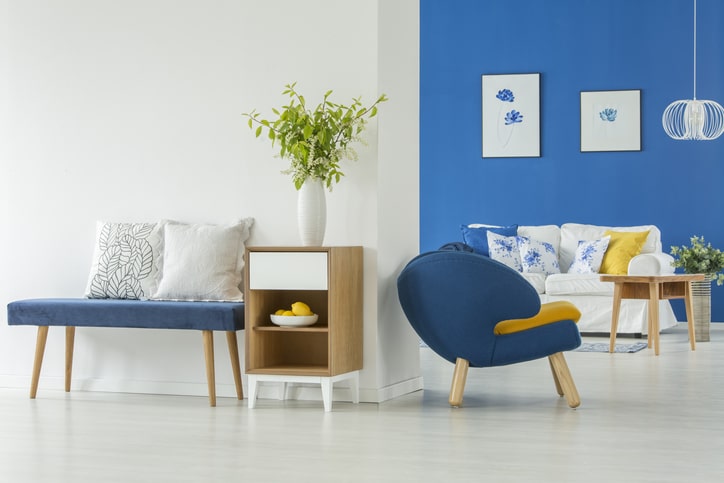
Understanding the color wheel is a critical tip to choosing a paint color as it helps you see how different colors interact, especially when transitioning from one space to the next. For example, grounding tones like beige or olive in entryways can make your home feel steady and welcoming.
In a family room, warm neutrals help create spaces where people want to relax. A soft robin’s egg blue hallway might feel open and expansive, while a moody gray accent in the dining room can make it feel more intimate. Even ceiling color, often called the fifth wall, affects how a space feels.
You don’t always have to use the same color across every room—sometimes painting just one wall in a contrasting color can subtly shift energy and focus. Always consider how the paint interacts with other elements in the room like furniture, lighting, and flooring to ensure harmony.
5.Think Beyond What’s Trending
While it’s tempting to choose the “color of the year,” choosing paint colors based only on trends can lead to regret. Some shades are discontinued quickly or have different undertones across brands and finishes. A neutral color from one line may not be an exact match in another.
To avoid surprises, look into timeless color schemes, such as an analogous scheme or a warm neutral paired with accent colors. Reliable collections from brands like Benjamin Moore or Sherwin Williams often offer long-standing shades like White Dove, which has become a staple among professionals in interior design.
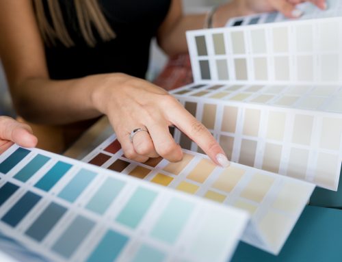
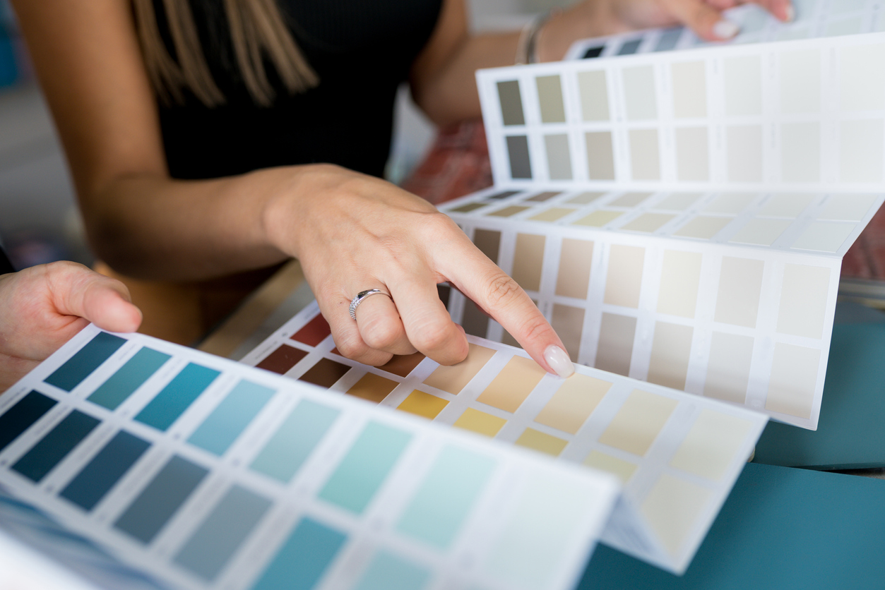
6.Test Paint for a Full Day, Not Just a Swatch
Instead of the classic dab of sample pots on the wall, paint a poster board and move it around the room throughout the day. Observe how the color changes under both natural light and artificial lighting. This gives you a realistic view of how it performs in your actual space.
Pay attention to how dark colors or light colors reflect differently depending on bulb type. Low-CRI lighting can warp even the most carefully chosen neutral paint colors, so always test using your actual lighting setup before committing to a perfect color.
7.Plan for the Future Use of the Room
Choosing interior paint colors also means thinking ahead. A guest bedroom might become a nursery, or a formal dining space could transition into a work-from-home office. Pick flexible wall colors that work for multiple functions.
Mid-range tones, subtle neutral colors, or shades lighter than bold accent hues offer the most long-term flexibility. If you’re painting an entire room, it’s also wise to test whether that dominant color feels too heavy or cold once it’s covering every surface. Here are ten common mistakes to avoid when painting your home.
8.Watch for Reflections from Floors and Furniture
Color reflects—especially off large, nearby surfaces. Dark wood floors, bright color tiles, or even metallic light fixtures can shift how paint looks once it’s on your wall. To detect this, tape a clean sheet of white paper next to the wall and observe it throughout the day.
Any colored tint you notice on the paper will likely affect the final paint color on your walls. These reflections can subtly impact how even the most carefully chosen color swatches behave across your entire home.
9.Consider Local Traditions and Cultural Signals
When you choose paint colors, you’re also communicating something about your taste, values, and how your home fits into its environment. In some regions, muted neutral paint colors are expected for historic homes, while in others, accent wall traditions or cultural color choices may dominate.
Respecting these local traditions can help your home feel more cohesive and may even support better resale value. Be mindful that darkest colors in certain architectural contexts might feel too imposing, while light colors may offer more balance.
10.Keep a Record of Every Paint Choice
After all the energy spent choosing colors, don’t forget to document them. Keep a folder with the names, finishes, and codes of each shade, whether you bought them from Sherwin Williams, Benjamin Moore, or another supplier. Save extra sample strips, leftover paint color samples, and notes about how the paint was applied.
If you ever repaint or patch a wall, having an exact match is a lifesaver. This is especially useful when matching colors for your home across seasons or updating only part of a small room or entire home years later.
Trust Gustafson Painting to Transform Your Home with Color Confidence
At Gustafson Painting, we don’t just paint walls—we help you choose the right paint colors to bring your vision to life. Whether you’re exploring color swatches, planning an accent wall, or need guidance navigating the color wheel, our expert team is here to help. Contact Gustafson Painting today and let’s turn your home into a space that feels as good as it looks.